A responsive UX/UI case study for a boutique cake designer, focused on improving
conversion through user research, A/B testing, and user-centered design.
Created as part of a professional UX certification course.
Introduction
This project was part of my UX coursework at Red & Yellow Creative School of Business, where I applied industry-standard methodologies to create a research-driven, user-friendly e-commerce interface.Through user research, wire-framing, and iterative testing, I refined an interface that aligns with user expectations while balancing business goals. This case study details my process, insights, and key takeaways.
I completed the course with distinction, achieving a 91% overall grade and finishing as the top student in my class.
You can click here to learn more about the actual course and modules it covered.
My Role
As a User Experience (UX) Designer, I was responsible for understanding the client’s business goals and user needs, conducting user research, developing personas, performing competitor analysis, and designing wireframes and interactive prototypes. I also facilitated usability testing to evaluate the prototypes and applied those insights to iterate and refine the designs.
Objective
Jenny Smith is an experienced baker and pastry chef. She is the owner of Jenny’s Cake Emporium, a high-end, expensive, luxury bakery that creates custom cakes for special occasions like weddings, corporate functions, and birthdays. Every cake Jenny makes is unique and is based on detailed in- person consultation with the client.Jenny is not very digital-savvy, but she recently came across a bakery site that convinced her to go digital. She’s decided to launch a mobile-friendly website – or perhaps create an app – to showcase her business and inform customers about her services, which are:
1. Her primary service is: creating amazing bespoke customer cakes.
2. Selling small volumes of baked goods through her physical store.
Jenny wants to create a simple, engaging, and stylish website that delivers an amazing customer experience. She needs a tool that will allow customers to contact her with any queries.
Interview Client
The first step in the UX process was to start with researching the client by interviewing her. The goal was to understand both her business objectives and the needs of her current and potential clients.
Sample Questions Asked:
1. What do you want your website to help you achieve?
2. Who are your typical clients or customers?
3. How do most people currently find out about your services?
4. What do you want potential clients to know or feel when they land on your website?
5. Is there anything you don’t want the website to do?
2. Who are your typical clients or customers?
3. How do most people currently find out about your services?
4. What do you want potential clients to know or feel when they land on your website?
5. Is there anything you don’t want the website to do?
Client Insights:
Primary goal: Jenny emphasised that she does not want to sell cakes online. Her goal is to use the website as a way for clients to book consultations, where she can collaborate with them to create highly personalised cake designs.
Client acquisition: The majority of her business comes from word-of-mouth referrals and people who have seen or tasted her cakes at events.
Target audience: Her clients are mostly women aged 30–60, often planning milestone celebrations such as weddings, baby showers, birthdays, or corporate functions. They value aesthetics, personalisation, and craftsmanship.
Tone and feel: She wants the site to reflect elegance and luxury, in line with her premium, bespoke offering. She noted that the visual storytelling and cake imagery would play a big role in this.
Important call to action: Jenny wants users to fill out a contact form or book a one-on-one consultation, rather than browse product listings or prices.
Key Client Quotes:
“I don’t want to sell cakes online — I want to book consultations.”
“Most of my clients come through word-of-mouth or from events where they’ve seen and tasted my cakes.”
“I want the site to feel luxurious, but not too over-the-top or intimidating.”
Primary Website Objective Insights:
Insight 1: To show off and build her brand reputation as a high-end luxury cake specialist. Through high quality visuals of products, a sophisticated high-end looking UI design, satisfied client testimonials, and emotional storytelling of Jenny’s passion for quality bespoke cakes.
Insight 2: Generate more business through inquiry’s leading to appointments on the site. By influencing people emotionally, who are interested in getting a cake for their function.
Insight 3: To expand the market reach of Jenny’s business, by offering a “digital store front” that can reach substantially more people through SEO.
Important User Action Insights:
Insight 1: Click on a Call To Action (CTA) to make an inquiry. Insight from the client shows that she gets a lot of word of mouth referrals from satisfied customers. So those people are already (or almost) sold on her and are coming to her website with the main objective to contact her. So, the website must provide them a clear and easy CTA to make an inquiry.
Insight 2: Browse the site. For those users who are interested in getting a cake for a function, but who don’t know about Jenny yet, it is important that the site will entice them to browse and consume the strategically designed contend: professional photos showcasing Jenny’s expertise, reading testimonials to learn from satisfied customers, and hearing from Jenny herself. To convert them from potential customers, to buying customers.
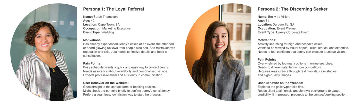
2 Key Personas Identified:
These insights helped define the two primary user personas, each with different motivations and needs — one already familiar with Jenny’s work and ready to make contact, and another still in the discovery phase, needing more visual and emotional persuasion before reaching out.
Competitor Research & Usability Testing
The next step was to understand how users interact with existing cake websites and to identify common pain points and best practices, I conducted competitor research combined with live usability testing.
Methodology:
I selected a few competitor baking websites provided by the project brief — all offering bespoke or premium cake services. I recruited real users from the target demographic (mostly women aged 30–60) to participate in short Zoom sessions. I assigned simple tasks and observed their behavior and reactions to understand usability, visual appeal, and emotional resonance.
Example Tasks:
1. “Go to this website and try to find the Red Velvet cake.”
2. “Explore and find a cake you personally love.”
2. “Explore and find a cake you personally love.”
Key Observations:
● Users often struggled to locate specific cakes due to poor navigation or unclear categories.
● Sites with large, high-quality visuals of cakes and minimal clutter made a strong positive impression.
● Emotional connection was a big factor: sites with behind-the-scenes photos or storytelling elements (like about the baker) were perceived as more trustworthy and likeable.
● Users liked seeing testimonials and event photos as it helped them visualize what the cake experience would be like.
Insights Applied:
These sessions helped me identify both what works well and what frustrates users on competitor websites. This directly informed the design strategy for Jenny’s site — including the importance of:
Insight 1: Clear, effective and Intuitive Navigation. Firstly, including a search bar as a navigation tool. When looking for something specific people really want a search bar to be able to find the item directly. Secondly: having navigation tabs that make sense and is intuitive is vital! Or else users don’t know where to click and go to find what they are looking for, causing them a lot of frustration.
Insight 2: Beautiful and unobtrusive UI design is vital. Too big text in jarring colours compete too much in the lay-out with the imagery of the products. Which made my testers not want to browse/spend time on the site.
Visual & UI Analysis of Competitor Site
In addition to user testing, I conducted my own visual analysis of two competitor websites to better understand how design elements contribute to a premium brand experience. This involved assessing typography, colour palettes, layout structures, imagery, and overall visual hierarchy. The goal was to identify common design patterns and industry expectations for high-end cake businesses — and to determine which elements could be improved or uniquely applied to Jenny’s brand. This helped shape the visual direction for her site, ensuring it felt both elegant and user-friendly.
I started with the research analysis method of Competitive Benchmarking. Looking at direct competitors' websites to Jenny's business, to identify some insights on best practices. I gained the following insights:
Insight 1: Beautiful and professional product photography: I started by Google searching on the internet for "Bespoke high-end cakes for events" to find relevant competitors to Jenny. Viewing the website, the first thing I noticed all the websites had in common was: Beautiful professional product photography, that gives the user a good view of what the products look like. This is relevant to Jenny, as the main product that she sells is her high-end cakes. No amount of user and business research, SEO optimisation, or beautiful and minimal UI design, and intuitive navigation will convince people to use her, if her product images look horrible.
Insight 2: Easy to use and intuitive navigation: I also observed a trend of easy to use and intuitive navigation, that is clearly visible and easy to find, where all Jenny's product offering is categorised according to type, to make it easier for people to navigate and browse through.
I also broadened my research by looking at websites in "Adjacent Industries", so not just her direct competition, as in other baking websites. By searching for "luxury brand websites" I wanted to get a broader data pool of what kind of UX and UI patterns and principles is used to convey a feeling of luxury and exclusivity.
Insight 3: UI design that conveys luxury: Lots of white space used in the lay out to make the design feel luxurious because of its ample breathing space around elements. Colours that signify luxury: earthy masculine colours, gold or silver that conveys expensive commodities like jewellery. Also, black or darker colours to convey exclusivity and prestige, in combination with white to create strong contrasts, makes the design feel powerful. As well as clean and elegant fonts to convey sophistication.
Bringing this into combination with looking at competitor sites, of more direct relevance of bakery's, where colours are used to convey feelings of "baking and cakes" (like pinks and other brighter colours) I arrived at the insight of using a colour palette of blush-pink, gold and white (with darker elements brought in by the images and overlays) to convey a "high end baking website". This is relevant to Jenny as this is exactly what she wants to position her brand as.
After doing user research (identifying the target audience via interviewing the client, and then testing those users on competitor sites) it is important to determine the optimal structure for the website. To determine this Information Architecture (IA) research was needed to inform:
● how the users think about information;
● what categories, labels and organisation systems make sense to them;
● how they would prefer content to be structured; and
● what tools and features are particularly useful to aid their navigation and use of the site.
Test Method and Structure:
I conducted Modified-Delphi card sorting method with three participants from the target demographic.
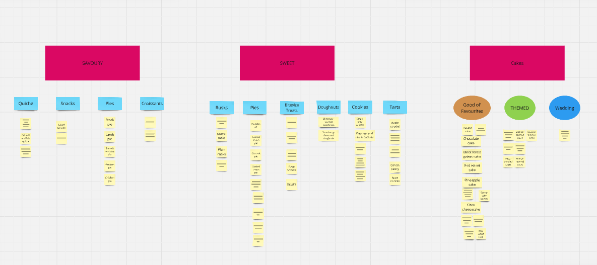
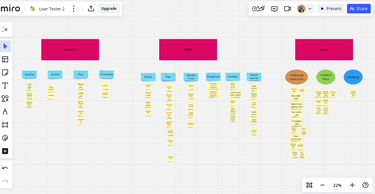
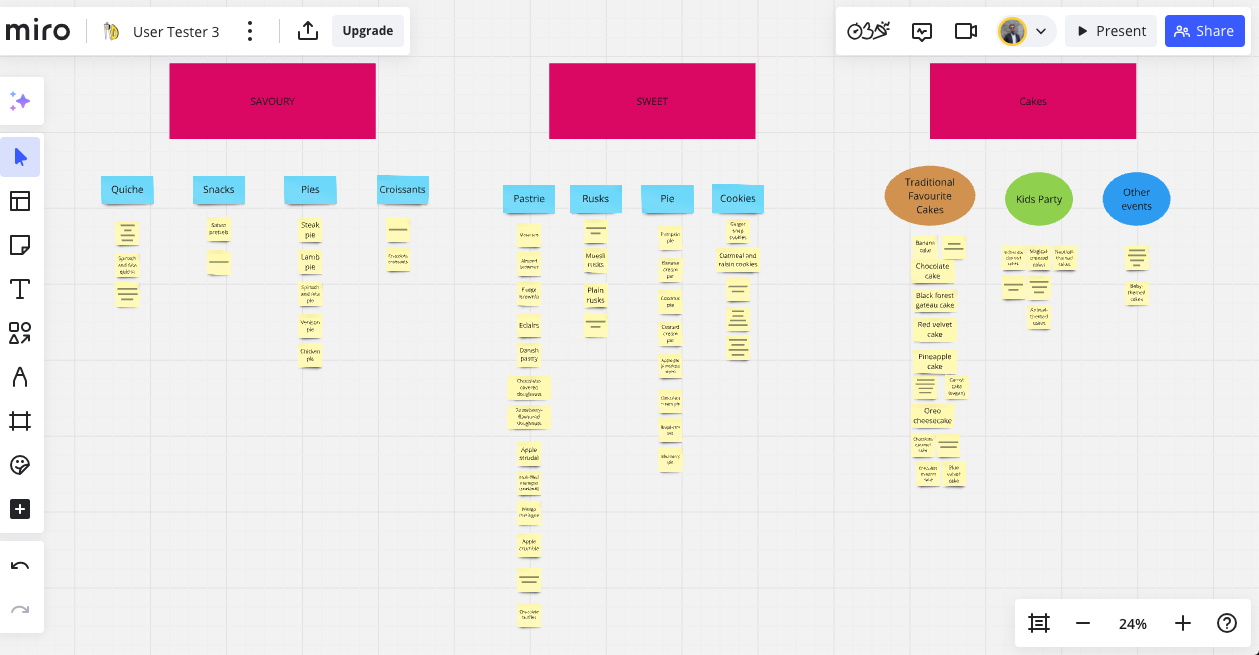
I asked the first tester to do an Open Card Sorting of the client's list of products. Then I asked a second tester to refine the structure the first tester produced. I then asked a third tester to refine this structure even more. This was done remotely over Zoom with the tester sharing their screen so that I could observe the testers process, and took notes. The test was run on the Miro platform.
Unsorted list:
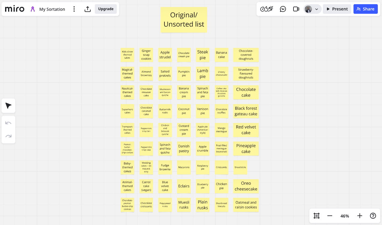
Tester 1 Sort:
Tester 2 sort:
Tester 3 sort:
Site Map
With this result I decided on my top level navigation and sub navigation and drew up the site map for the website.
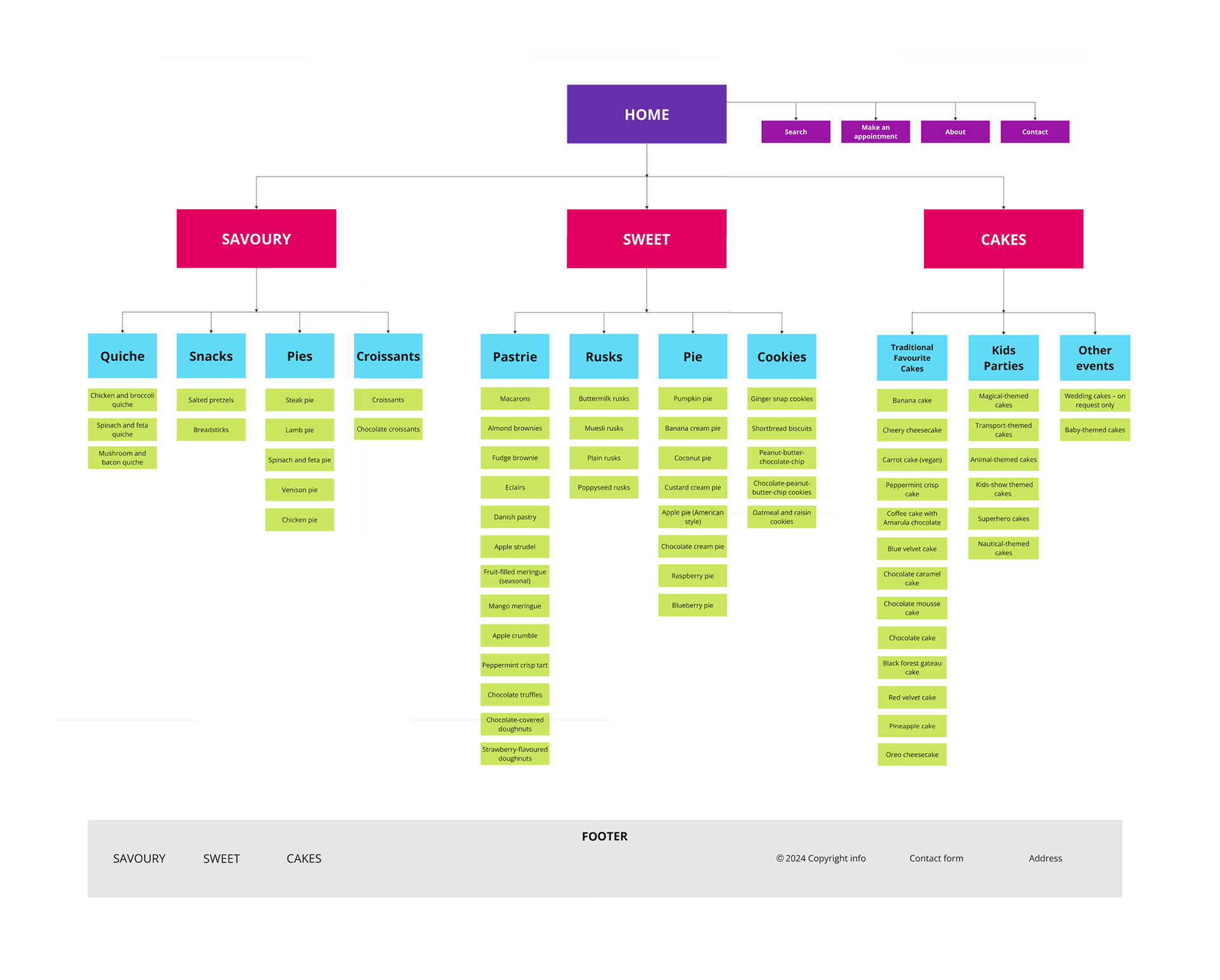
Following this modified Delphi card sorting exercise, I was able to identify clear patterns in how users naturally group and label product categories. These insights directly informed the structure of the website’s navigation and overall information architecture.
To ensure clarity and ease of use, I designed a static top navigation bar, positioned consistently across all pages. The navigation is placed at the top right of the screen, adjacent to the logo on the top left—aligning with established web conventions and user expectations. This fixed positioning keeps the menu always visible, reducing friction and helping users orient themselves as they browse.
The primary navigation menu includes the key product categories surfaced during card sorting:
● Something Sweet
● Something Savoury
● My Amazing Cakes
Lower-priority pages, such as About and Contact, are grouped within a hamburger menu to minimize visual clutter while still remaining accessible.
On mobile, the navigation simplifies to a responsive hamburger menu in the top-right corner to conserve screen space—again, matching common UX conventions and user expectations.
Additionally, I included a search function for users who prefer to search rather than browse. On desktop, the search appears as an icon beside the navigation bar, expanding into an input field when clicked to maintain a clean aesthetic. On mobile, the input field is expanded by default to enhance usability, based on user testing which showed participants were less inclined to tap icons on smaller screens unless clearly labeled.
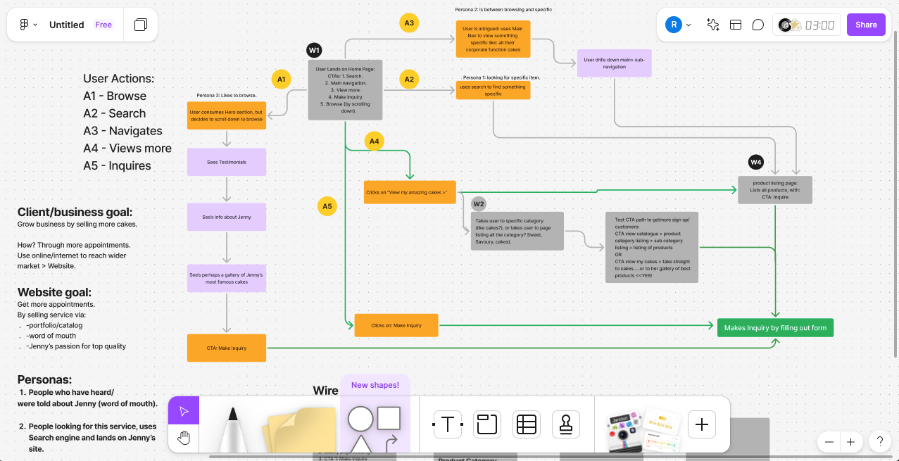
I then went on to design the User Journey map, fuelled by the insights from the research, to work out the CTA's. The point of this is to help visualise the paths required for the different user persona's to take the desired actions required to fulfil website's objectives.
In this case the goal of "the user making an inquiry to book a consultation" has been identified as the main objective of the site, desired by the client.
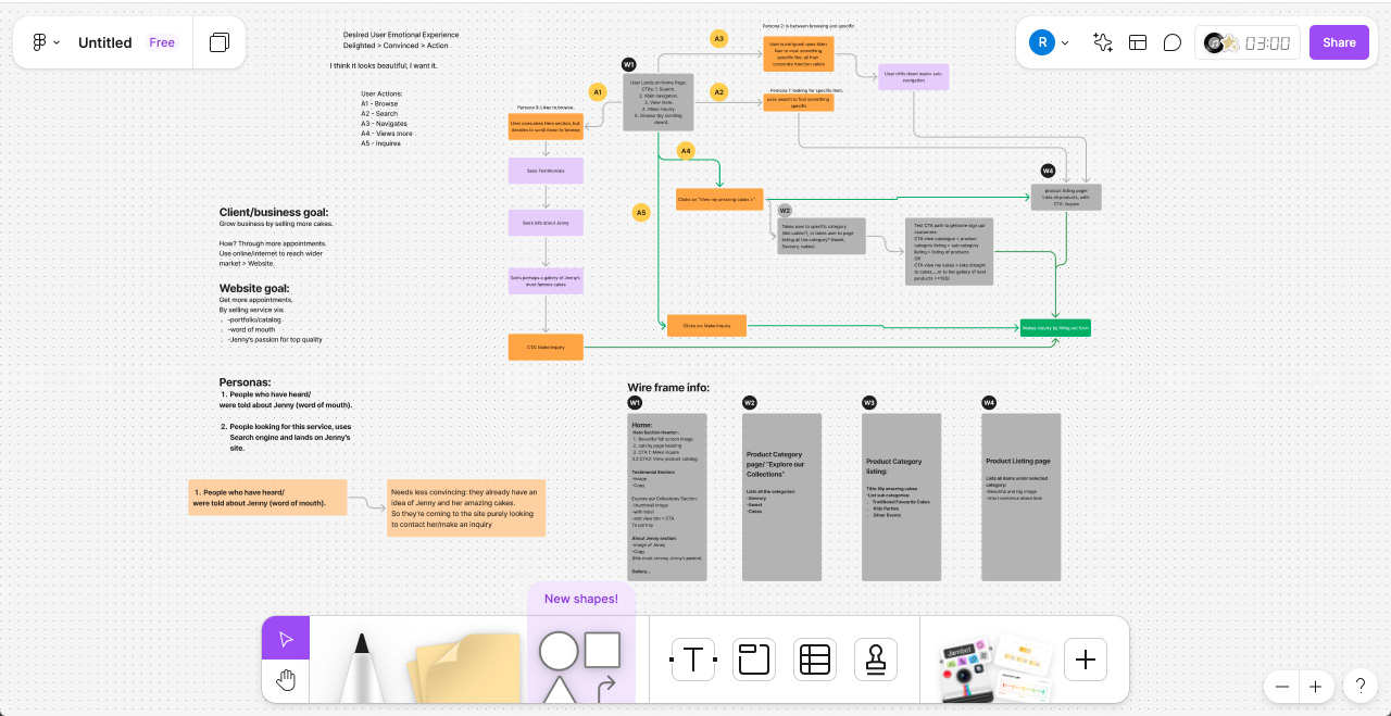
Zoomed in on call to action map:
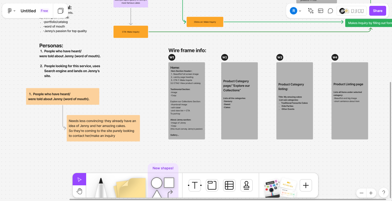
Zoomed in on wire frame info:
Wireframe Design
This informed me on what key pages are needed to achieve this desired goals, as well as what the information and content on those pages need to be, to achieve these goals from the users. I then went on to design low fidelity wireframes, for these pages.
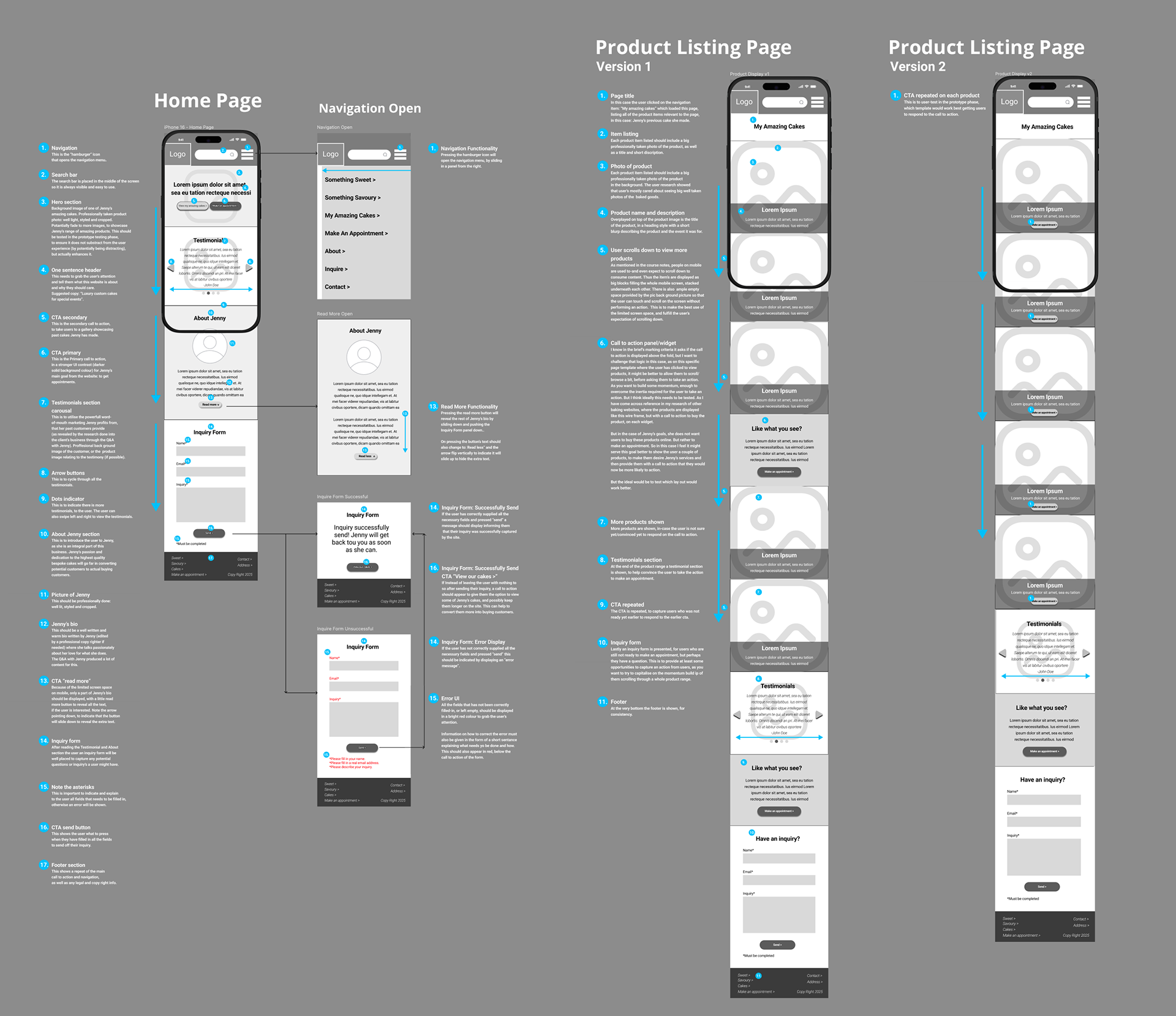
After this process was signed-off it was time to move on to the UI design process. Creating high fidelity wireframes to prototyping them for testing.
The next step was to design a beautiful and user research driven UI design.
Colour Palette Design
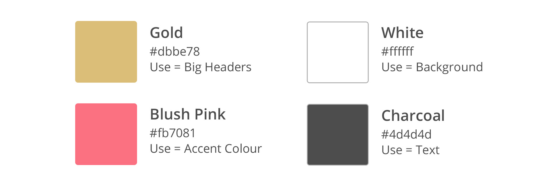
Creative rationale for the colour palette design
To signify the luxury, elegant, stylish aspirations of the brand I decided to go with a gold shade (or a burnished yellow) as gold is strongly associated with luxury and riches. It can also pass as a shade of the “sunflower yellow” colour the client stated she likes.
Taking inspiration from the rival websites I looked at, I explored shades of red and pink. This worked nicely to make the logo feel more feminine; thus appealing to the target audience. I tested these colour combinations on one of my previous test subjects for Jenny’s site, and she agreed, preferring the pink, saying it looks more like cake and confectionary.
In my research on colour psychology and associations, (especially around combinations that communicate luxury and elegance) and I found that this is indeed a colour palette that works to convey a feeling of luxury.
I decided to use white as a neutral colour to balance the gold and pink. White will mostly be used in the background, and for holding shapes as well as where text over an image needs to appear.
Gold will be used for big headers. Blush pink will be used as an accent colour, to draw the user’s attention to top priority call to actions, as well as a high-light colour, to indicate to the user interactive elements, like navigational elements. I will use a charcoal (dark grey) colour for body copy and small headers. This will make reading lots of text easier on the user’s eyes.
Type Design
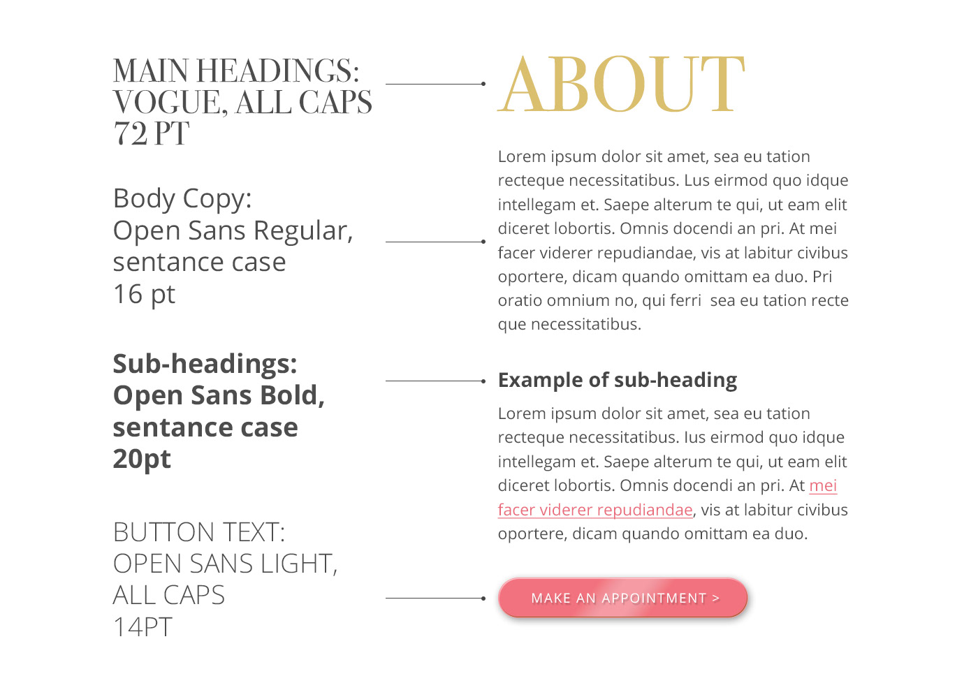
Creative rationale for the type design:
To create a nice contrast in the typography I decided to use two different font types in my design: Bodoni and Open Sans. Seeing as Bodoni is a serif font with a lot of style and elegance, this will serve to portray the high-end luxury of the brand. This I will use for display purposes, like big headings, to grab the user’s attention.
To bring relief to this heavy styled serif font, I decided to contrast it with Open Sans, which is a very minimal and clean sans-serif font. This will create a feeling of elegance and style in the overall design while keeping it fresh and relevant.
I will use Open Sans for smaller text (sub navigation and call to action, also as the slogan on the logo) and where a lot of text needs to be read (body copy) to make it easier to read. When a user needs to read a lot of text, it is difficult for the eye to take in and process letters if they are very stylised.
Logo Design
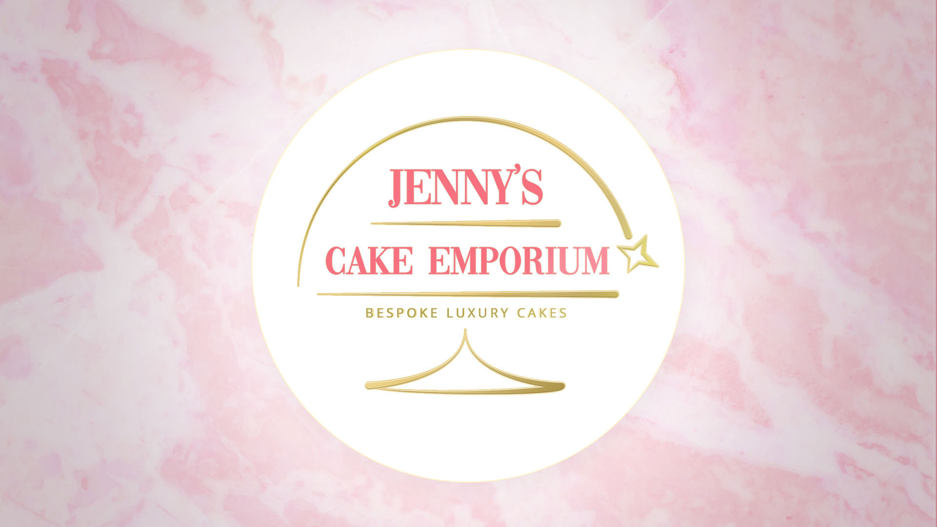
Creative rationale for the logo design
In its most basic form, the logo needs to communicate “high-end cakes". To show this I looked at other cake bakery logos and was inspired by the “cake-display-stand-with-lid” concept, as this suggests high-end cakes. I also thought the “layers” in the stand concept work well with the long name of the business, to hold the text, and underline them.
Then I felt it was important to bring into the logo an element that conveys how “special” Jenny’s cakes are, as this is her unique selling point that sets her cakes apart from the competition. To do this I took inspiration from one of the competitor sites I looked at, where a "star" icon was used in the logo. Like a little magic sparkle. I worked this into a fresh concept where the star acts like a shooting star flying over the logo, creating also the lid of the cake display case. This symbolises the magic specialness of Jenny’s cakes, as if she is a fairy godmother, waving her wand and making your wish, for the most amazing cake at your event, come true.
To further convey luxury and elegance, I used ample white space alongside the minimalistic style for the tray and shooting star shapes. To communicate Jenny’s hand-made quality in her cakes, to make them feel organic, I gave a sloping change of thickness to the shapes. This makes the lines look like they were created almost by piping icing. But I purposely stayed away from making the shapes wiggly, to keep it feeling professional and high-quality.
Mobile First Design
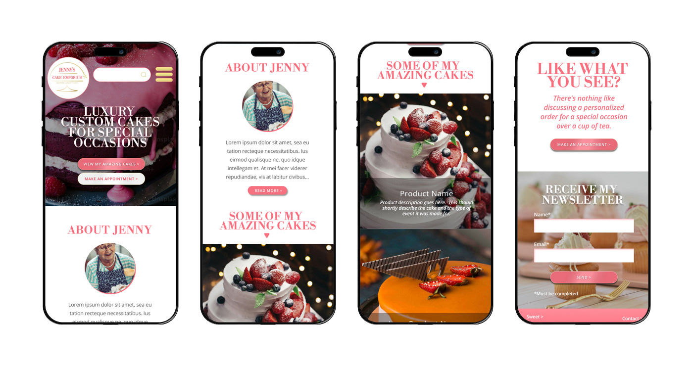
Next I jumped into Figma to start crafting the mobile lay-outs.
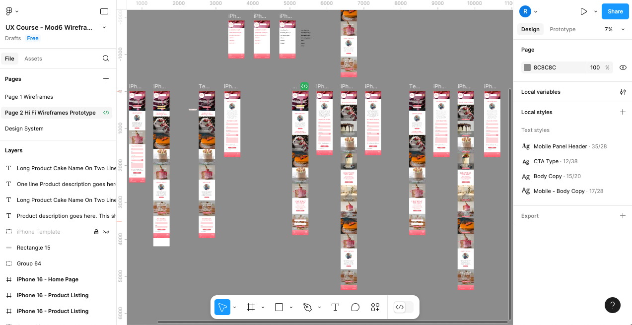
Mobile Design
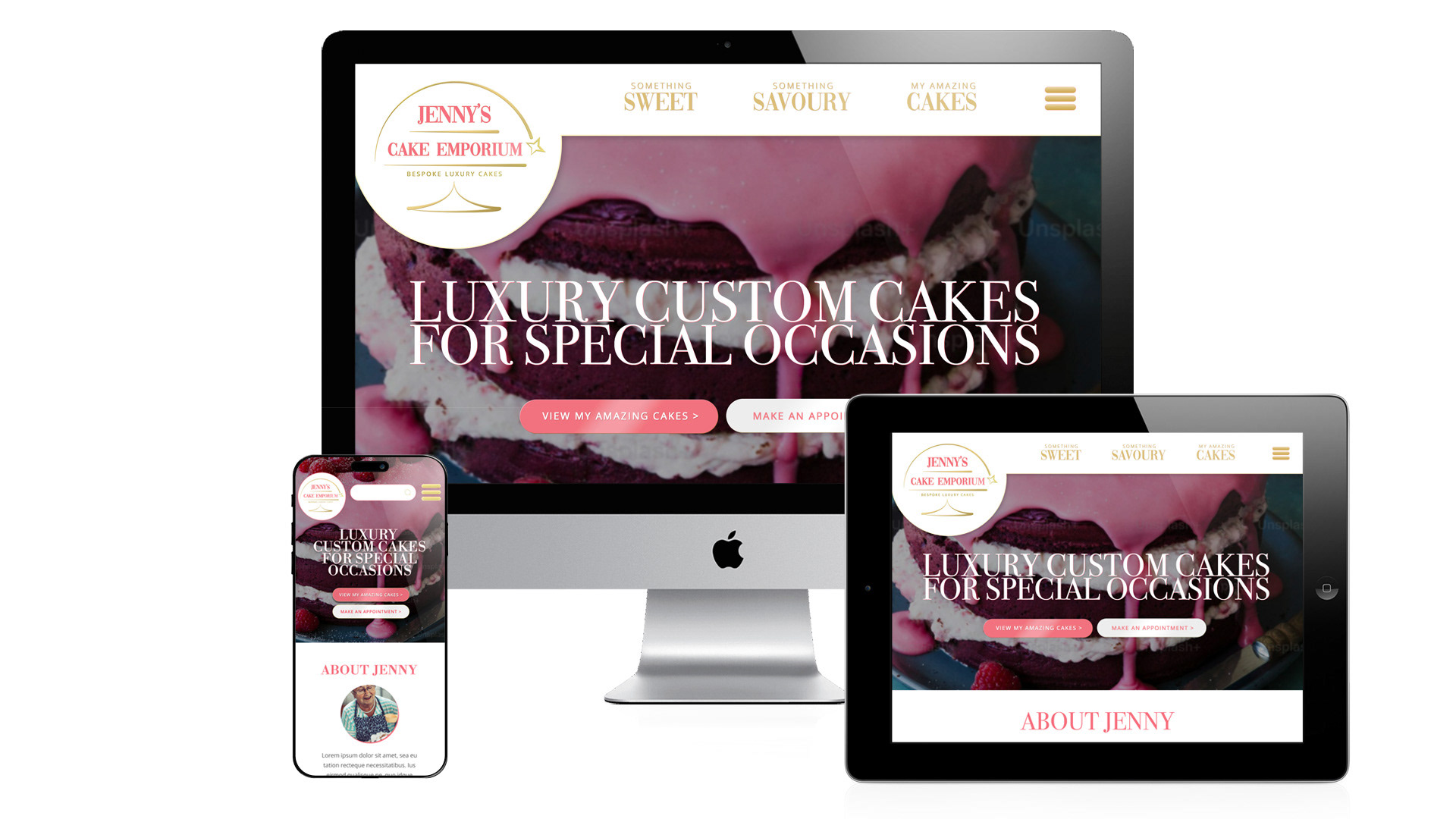
Responsive Design
Prototype Testing & A/B Insights
I applied the Qualitative Observation/user labs method, as this is the method used to get an overview of how users respond to and engage with your website or app. So you can "observe them" navigating the site, giving them certain objectives to do, and then accessing how easy it was for them to achieve those objectives. The qualitative method is also suited for this test as it is used for when you want specific user feedback on details in the design and user flow. To get insight on how the user actually felt when navigating the site.
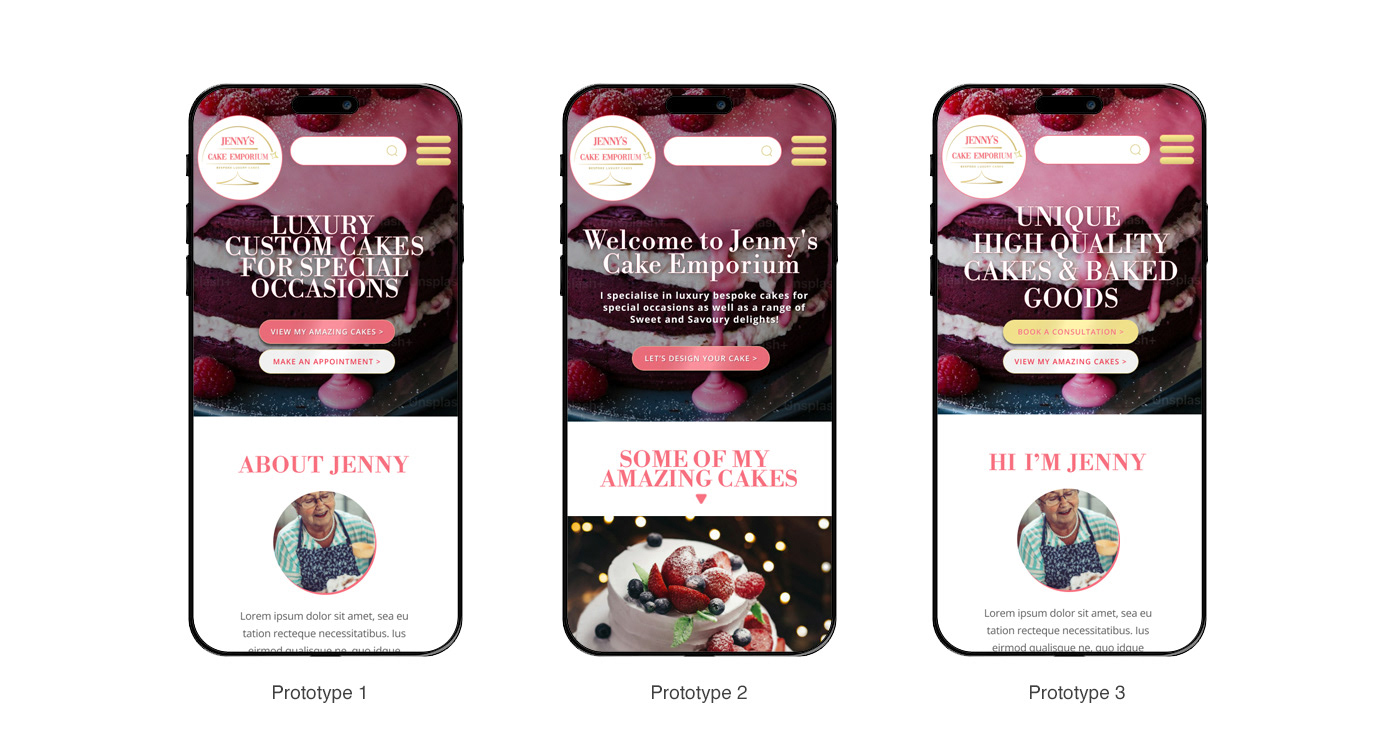
I set up 3 prototypes to A/B test 3 versions of the top header and main CTA's:
The Test was Set-up as Follows:
Test all 3 Prototype Versions with Scenario 1, and then Scenario 2.
Scenario 1. Test Ease of Navigation to Booking
Persona 1: User is already aware of- and convinced- Jenny's services, and comes to the site specifically to make a booking to contract her services.
Goal: Test whether users can quickly and intuitively find the option to book a face-to-face consultation.
Task Example: You were at an event where a jenny cake was used. You loved it and “You’re interested in ordering a bespoke cake for your event. Does the home page motivate you to take action? If so do.
Success Indicator: Users found home page motivated them to take action, users easily locate the booking option within a few taps without confusion. booking form easily, and want to fill it in.
Task Example: You were at an event where a jenny cake was used. You loved it and “You’re interested in ordering a bespoke cake for your event. Does the home page motivate you to take action? If so do.
Success Indicator: Users found home page motivated them to take action, users easily locate the booking option within a few taps without confusion. booking form easily, and want to fill it in.
Scenario 2 - Test path to convince potential customer to book.
Persona 2: User is looking to hire some one to create a bespoke cake for their upcoming event, but has never heard of Jenny. User has landed on her site by searching on Google.
Goal: Test whether potential customers will be converted into buying customers.
Task Example: "You are interested in ordering a special cake for an upcoming event. You've never heard about Jenny but landed on her site from searching on Google. You would first like to get a better idea of what she can do, hear about satisfied customers, and hear more about Jenny, then if you feel convinced, you would like to make an appointment. So make an appointment.
Does all this bring you to want to book? If so, could they easily book?
Success Indicator: User can find and view Jenny's catalogue of products, see testimonials and read about Jenny, easily, and then feel more inclined to make a booking. User can then find the booking form easily, and want to fill it in.
Questions:
• When you found the form, Did you want to fill it in?
• Which of the 3 templates did you find most appealing?
• Which of the 3 templates did you find most compelling to make a booking?
• Which of the 3 templates did you find most easy to make a booking?
Prototype Version 1:
Prototype Version 2:
Prototype Version 3:
Summary of Key Insights Gathered
Overall Usability
• Testers navigated the prototypes with ease and began scrolling immediately.
• Positive first impressions were driven by strong visual design and high-quality product images.
• Users clearly identified and engaged with the primary CTA after initial scrolling.
CTA Design & Placement
• Both testers preferred the gold button version of the main CTA, citing higher visual prominence.
• They appreciated that the primary CTA was repeated further down the page for convenience and clarity.
• The clean white CTA block (against photographic content) was praised for visual contrast and effective hierarchy.
• Versions with individual CTAs on each product image were not well received—users found them visually cluttered and less effective.
CTA Wording Preferences
• “Book a consultation” was the most well-received CTA copy across testers. Viewed as inviting, collaborative, and clear about the next step.
• “Make an appointment” was perceived as too clinical by one tester.
• “Make an appointment” was perceived as too clinical by one tester.
• “Let’s design your cake” received mixed responses—one found it exciting, another found it presumptive and alienating.
• Insight: Use CTA copy that appeals broadly and avoids assumptions about the user's intent or preferences.
User Needs & Pain Points
• Pricing Transparency:
• Both testers wanted at least a rough price indication before submitting the inquiry form.
• This was a key blocker in the decision-making journey.
Style Variety & Trust
• One tester wanted to see a broader range of cake styles to feel confident the baker could deliver modern or custom designs.
• Concern arose that the brand tone (e.g., photo of Jenny, tea-time messaging) might signal traditional over trendy.
• Suggested solution: include an option for users to upload a reference image when submitting a request—building trust and creative alignment.
Recommendations for the next iteration of testing
• Add a price range.
• Add more variety in Jenny’s product photos.
• Add a feature to attach a file when filling in the Inquiry form (so users can attach a reference image of the type of cake they have in mind).
• Add and clearly display the contact and location details, so that users can see whether the business is close to them or not.
• Also add copy to the inquiry for explaining that the consultation can be done in person, or on a remote base (if the user is physically too far away from where Jenny is located).
• Showing category thumbnails lower on the home page, so the user can click to view all of Jenny’s previous products under a specific event type.
• With testimonials that relates to those specific events.
Even though I’ve worked across UX, UI, and web design for many years within digital agencies, I chose to take on this course because I believe that truly great UX designers are always learning. User experience is a constantly evolving field—new methods, technologies, and user behaviours continue to reshape how we design. I wanted to sharpen my skills, fill in any knowledge gaps, and deepen my understanding of the full UX process from research to testing. This course helped me do exactly that, broadening my perspective and reaffirming my passion for crafting thoughtful, user-centered digital experiences. Thank you for taking the time to view this case study.
Thank you for viewing.